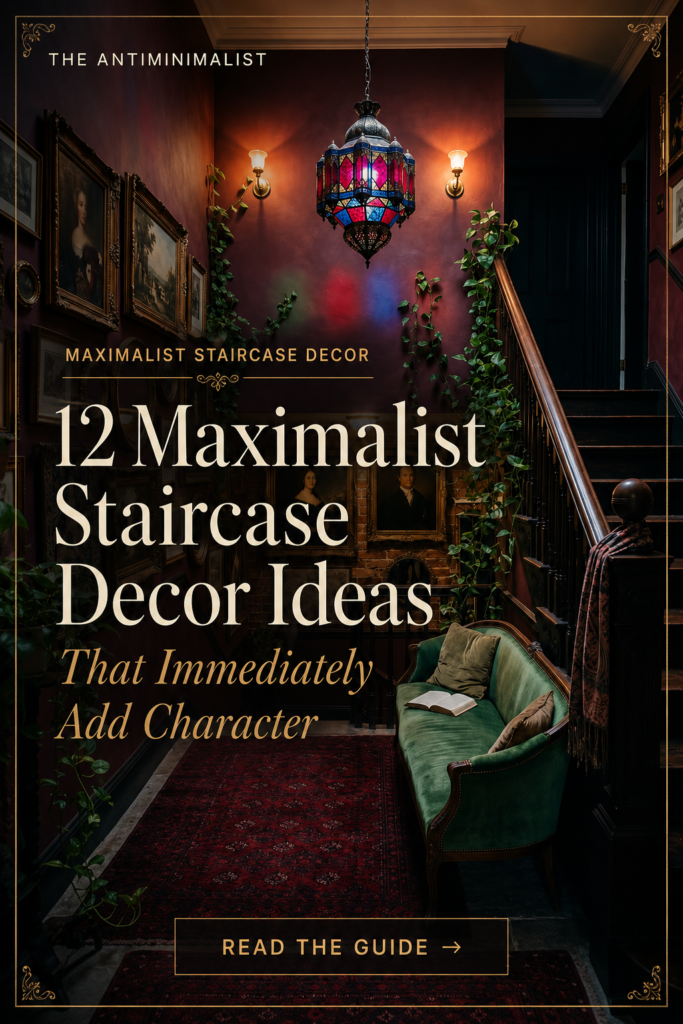
A maximalist staircase decor moment turns the most overlooked wall in the house into the most photographed one. The staircase wall is the largest uninterrupted vertical surface most homes have, the landing is one of the few spots that begs for a single dramatic moment, and most people leave both empty because they don’t know what to do with them. The 12 ideas below are the exact products and decisions that turn a builder-grade staircase into the part of the house you slow down for — and they work across dark academia, vampire romantic, witchy, and dark cottagegoth aesthetics.
12 Maximalist Staircase Decor Ideas
1. Hang a Statement Pendant Lamp in the Stairwell That Photographs Better Than Anything Else in the House
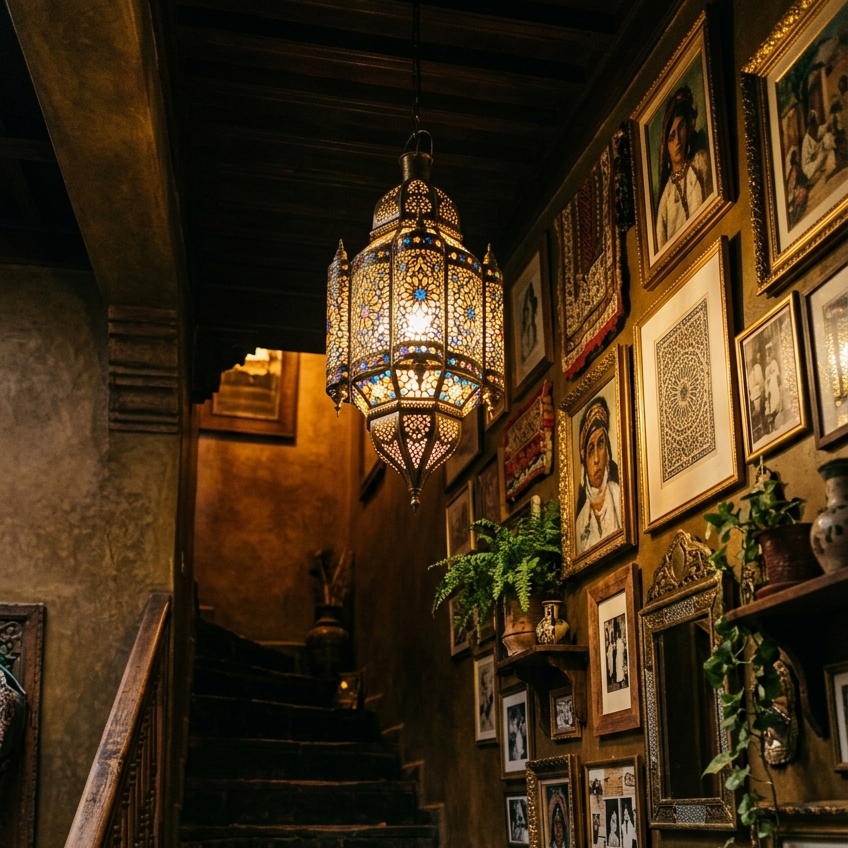
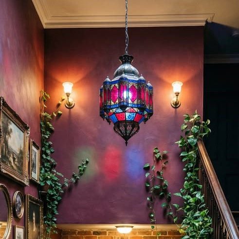
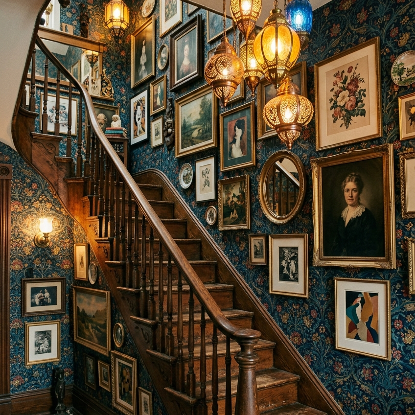
The stairwell ceiling is usually the highest in the house, which means it can accommodate a fixture that wouldn’t fit anywhere else. Two paths depending on aesthetic. A Moroccan stained glass pendant in jewel-tone panels — burgundy, sapphire, amber — throws colored light onto the walls and gives the whole stairwell the feeling of a small chapel (both reference images run this play). Or a black crystal gothic chandelier with cascading drops, for the goth or vampire romantic version. Choose a fixture that hangs at least 7 feet above the highest stair to avoid head clearance issues, and run it on a dimmer so the colored light pools rather than blasts.
Copy this idea:


2. Mount Brass Wall Sconces at Regular Intervals Along the Climbing Wall
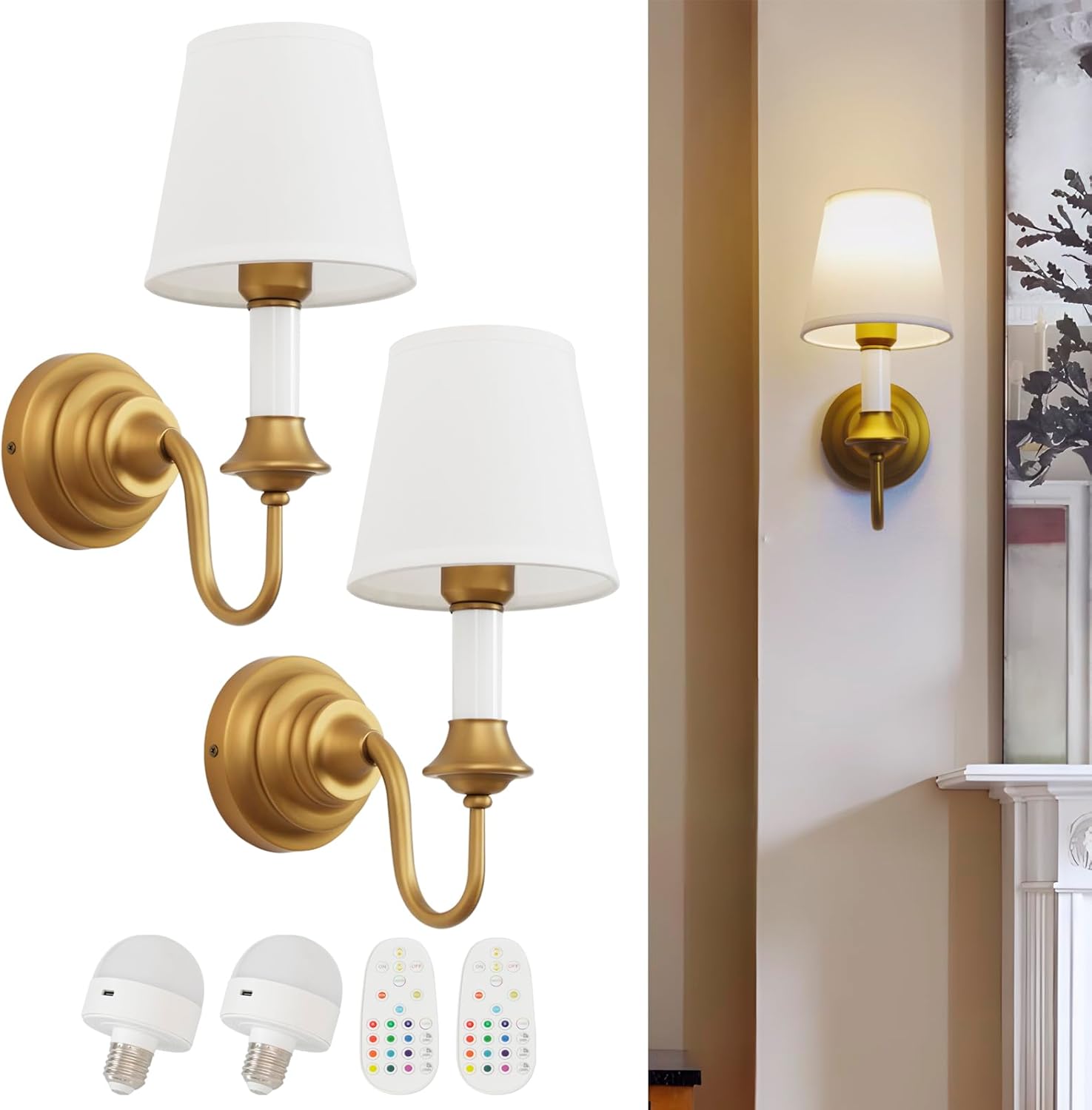
The pendant lamp lights the stairwell from above; the sconces light the wall from beside. A pair of brass wall sconces mounted along the climbing wall — one near the bottom, one near the top, evenly flanking the gallery wall in between — adds the warm directional light that lets the art read properly. Plug-in versions don’t require electrical work; hardwired versions look slightly cleaner if you have an electrician. Choose aged brass or antique bronze finishes that read inherited rather than installed. Mount them at about eye level when standing on the stair directly below.
Copy this idea:
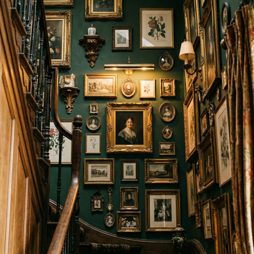
3. Build a Gallery Wall That Climbs the Stairs in a Mismatched Frame Cluster
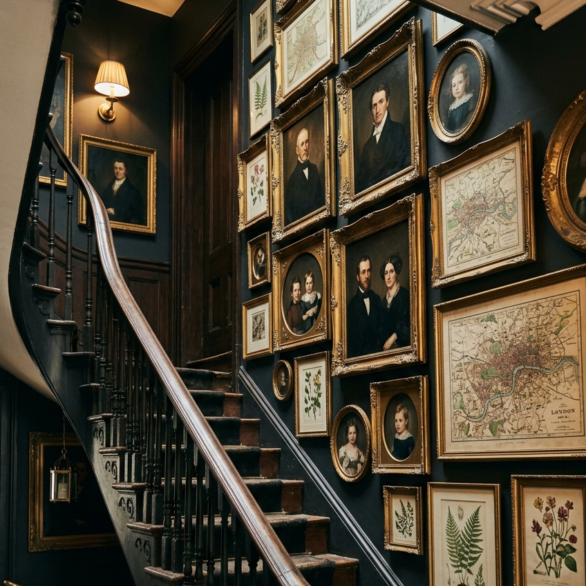
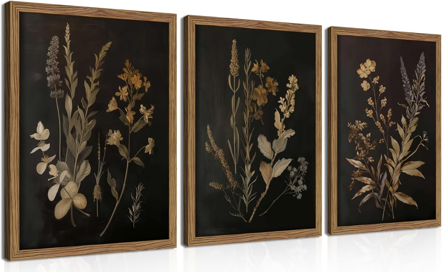
The climbing gallery wall is the single most consequential decorating decision in any maximalist staircase. The key technique is the climb itself: instead of hanging frames in a level line, the cluster ascends with the stairs at roughly the same angle. Anchor with two or three larger pieces — a Victorian portrait in a heavy gilt oval, a 19th-century map, a stormy landscape painting — and fill around them with smaller botanical prints, daguerreotype portraits, small antique mirrors, and a single small tapestry. Mismatched frames are the entire point. Mix gilt, dark wood, and aged bronze in varying shapes — rectangular, oval, round — and resist any urge to make the wall look planned. The best ones look like they were added to over decades.
Copy this idea:

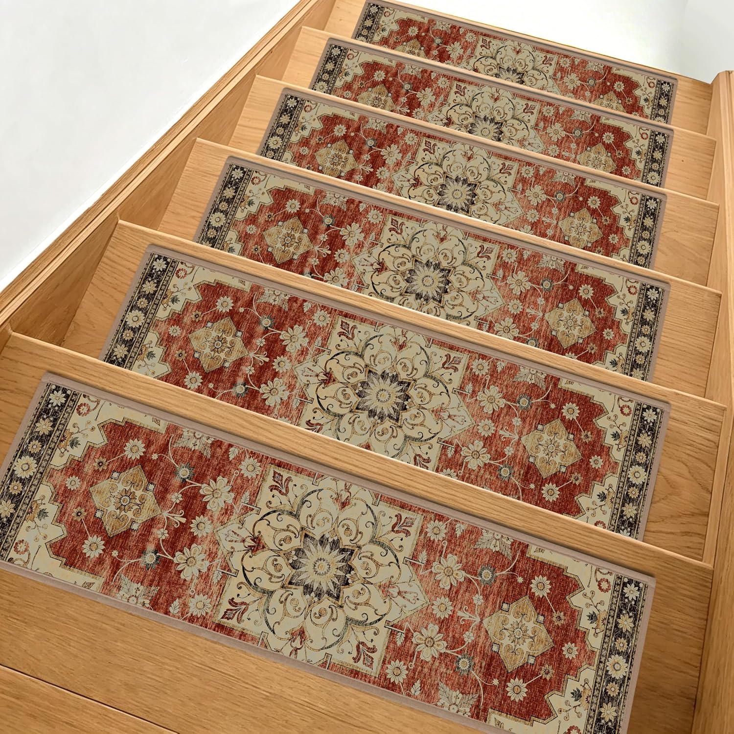
4. Lay a Patterned Persian or Kilim Stair Runner Anchored With Brass Stair Rods
The treads are an entire decorating decision most homes leave bare. A patterned runner — Persian medallion in burgundy and navy, kilim in warmer reds and creams, or a William Morris-style botanical — runs down the center of the staircase with about three to four inches of stained wood visible on each side. Anchor it with brass stair rods at the bottom of each riser. The rods are the styling detail that distinguishes a runner that looks installed from one that looks dropped in temporarily. Measure the staircase rise and run carefully before ordering — runners come in standard widths but length needs to match the specific number of treads you have.
Copy this idea:


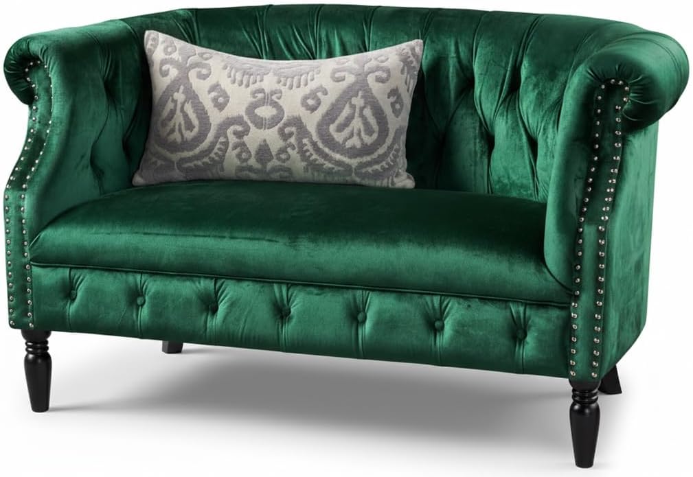
5. Place a Small Velvet Settee or Bench at the Landing or at the Bottom of the Stairs
The landing is one of the most underused pieces of square footage in any home. A small velvet settee — burgundy, emerald green, or deep plum — creates a moment at the half-landing or the top of the stairs that turns the staircase into a destination rather than a passage. Choose a piece small enough to leave clear walking space (most curved-back settees are 48–55 inches wide). Drape a chunky knit throw across one arm. Set a small stack of worn-spine books and a candle on the floor beside it. Nobody ever sits on the landing settee. That’s not the point. The point is what it does to the photograph of the staircase looking up.
Copy this idea:
6. Paint the Climbing Wall in a Saturated Color That Carries the Gallery
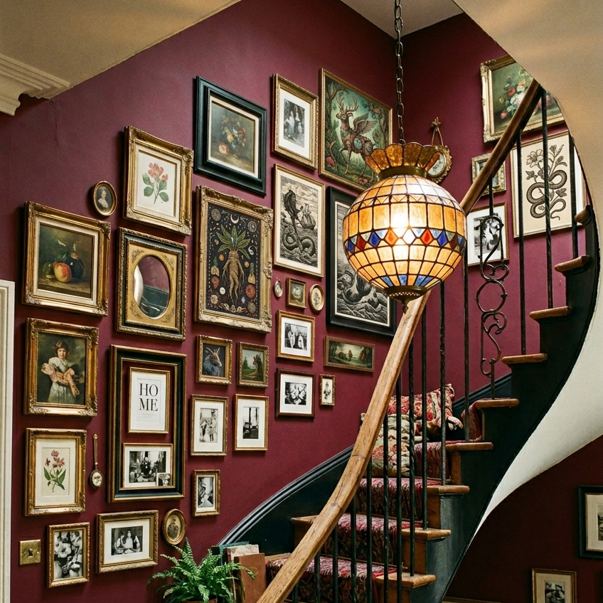
The wall color decides whether the gallery wall reads as deliberate or as decoration. The climbing wall in a maximalist staircase should be saturated, not neutral — burgundy, deep navy, near-black charcoal, forest green, oxblood, or aubergine. Both reference images carry burgundy and navy respectively, and the gallery wall reads heavier against each because the dark wall absorbs ambient light rather than reflecting it. Test the paint on at least a four-foot by four-foot section of the actual wall for a full week before committing — staircase walls catch unusual angles of light at different times of day, and a color that reads correct at noon can read wrong at sunset. Specific recommended paints: Farrow & Ball Preference Red, Sherwin-Williams Tricorn Black, Benjamin Moore Hale Navy.
7. Let Trailing Plants Cascade From the Top of the Stairs or a Wall Hook
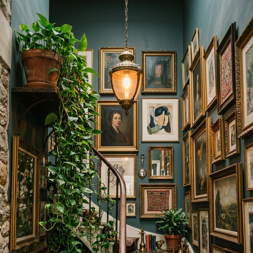
A trailing plant overhead does what no other single object can in a stairwell — it softens the geometry of the climbing wall and adds the only living, moving element in the room. A pothos at the top of the banister with vines that drape down across two or three steps. An English ivy on a wall hook beside the gallery cluster. Both reference images run this exact move and the cascade is the photograph’s secret weapon. Aged terracotta or vintage brass pots only. Slip plastic nursery pots inside a terracotta cover pot if needed — the cover pot is the entire visible difference between a plant that reads as inhabited and one that reads as bought yesterday.
Copy this idea:

8. Anchor the Landing With a Small Persian or Vintage Wool Rug
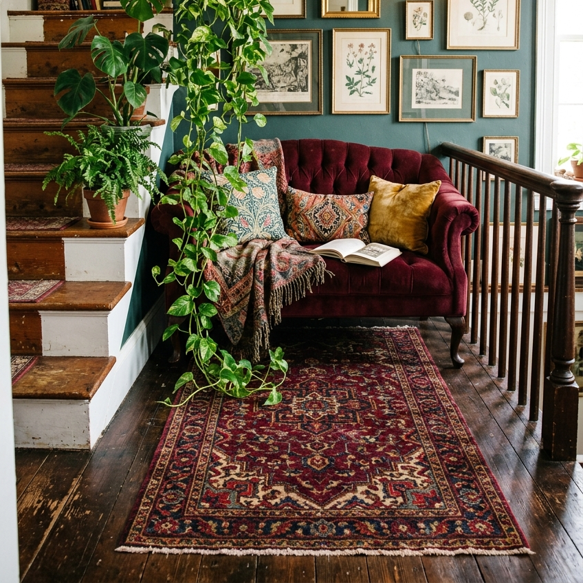
The landing is its own room — it deserves its own rug. A 3×5 or 4×6 Persian or vintage wool rug anchors the settee, ties the landing into the same color palette as the runner below, and gives the half-landing the quality of being a deliberate stopping point rather than transitional space. The rug can match the runner exactly (matching set), coordinate (different design, same palette), or contrast (different palette but harmonious tones). The contrast option is the most maximalist — a kilim landing rug above a Persian runner reads as accumulated rather than ordered as a set.
Copy this idea:

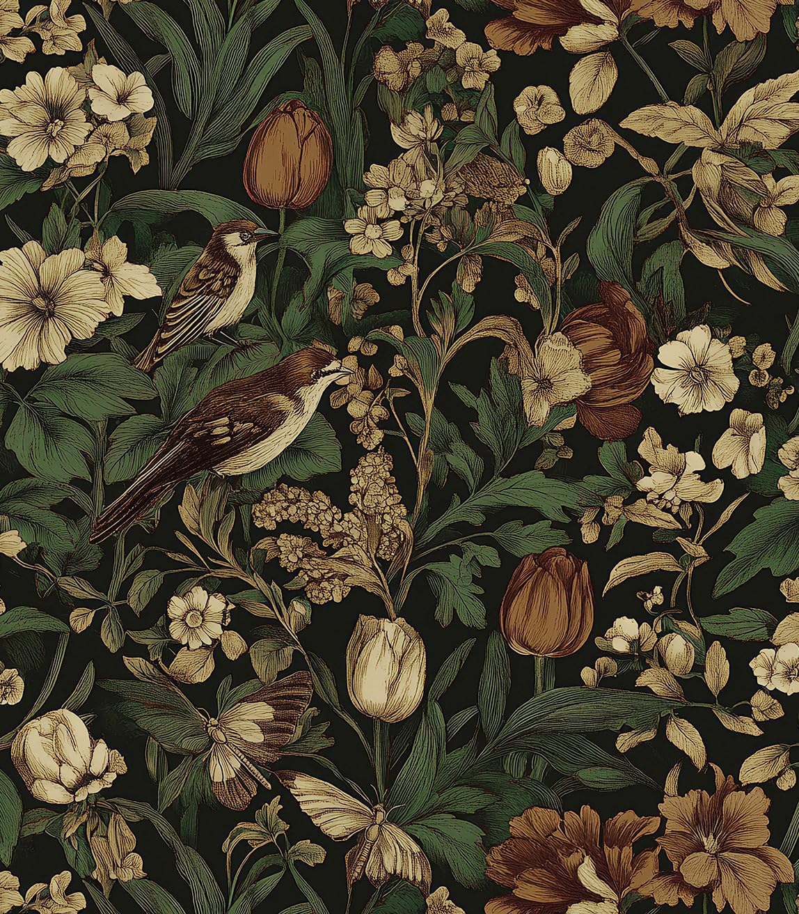
9. Cover the Climbing Wall With Maximalist Wallpaper Instead of Paint
If paint feels too restrained, wallpaper takes the climbing wall the full distance. Three direction options. A dark damask in burgundy and gold (the vampire romantic move). A William Morris-style botanical in deep green, navy, and rust (the dark academia and dark cottagegoth play). A celestial pattern in deep purple and gold with moons, stars, and constellations (the witchy variant). Peel-and-stick options from Amazon and direct manufacturers make this renter-friendly — installation takes one afternoon and removal doesn’t damage drywall. Wallpaper plus a gallery wall is the maximalist play; either alone is restrained by comparison.
Copy this idea:
10. Hang a Medieval or Botanical Tapestry on a Stretch of Wall That Asks for Texture
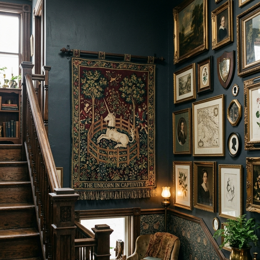
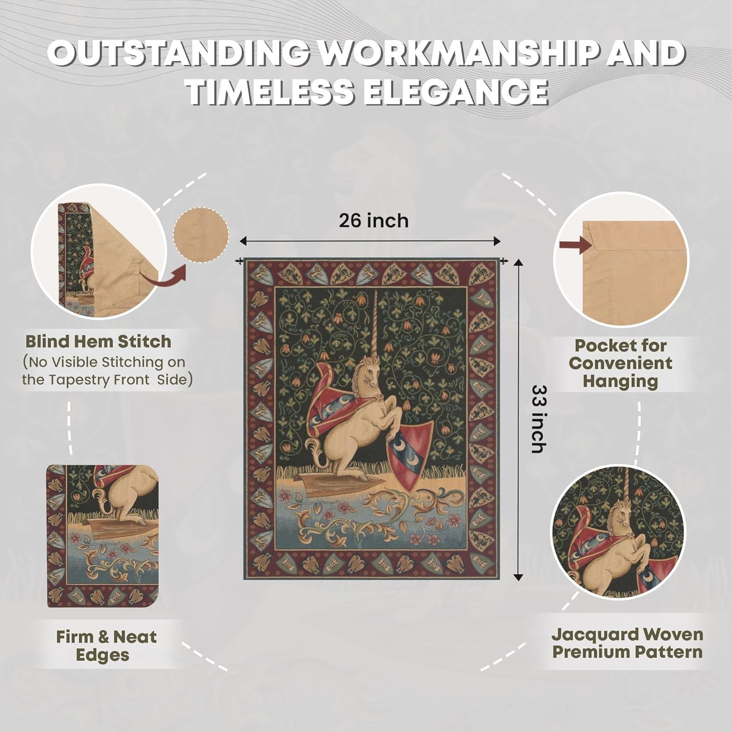
One non-framed piece on the staircase wall changes the entire visual rhythm. A medieval-style tapestry — a unicorn, a botanical, a Lady and the Unicorn-style scene, a celestial chart — hung from a brass or iron rod on the wall opposite the gallery, or on a stretch of bare wall above a small landing, breaks up the procession of framed art with a different material. Tapestries are also the single best decorative trick for absorbing sound in a stairwell, which is a problem most maximalist staircases don’t realize they have until they fix it. Look for one between 24 and 40 inches wide. Smaller reads as decorative; larger reads as commitment.
Copy this idea:
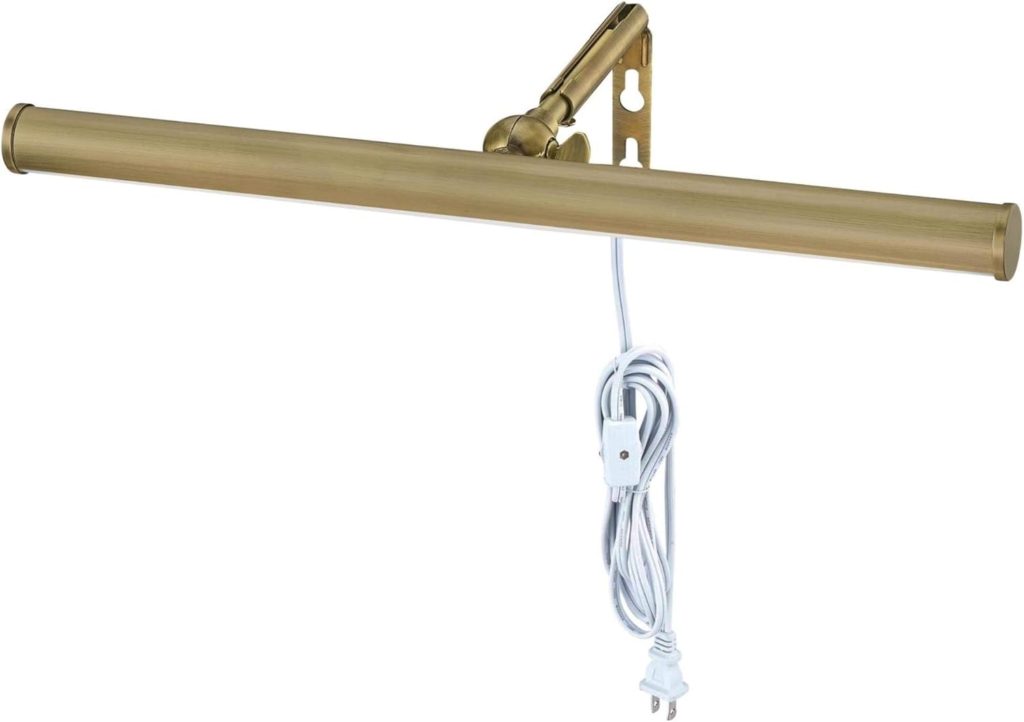
11. Add Brass Picture Lights Above the Heaviest Frames in the Gallery
A brass picture light mounted above the heaviest piece in the climbing gallery — usually the anchor portrait or the largest landscape painting — turns the gallery wall into a small museum after sundown. The directional warm light catches the gilt frames, throws shadow across the dark wood ones, and gives the staircase the after-hours-gallery quality that no overhead pendant alone can produce. Plug-in versions don’t require electrical work and run cord along the back of the gallery toward the nearest outlet. One picture light per major piece is the right ratio — adding lights to every frame turns the wall into a row of beacons rather than a single illuminated focal point. [Internal link: Dark Academia Living Room Ideas]
Copy this idea:
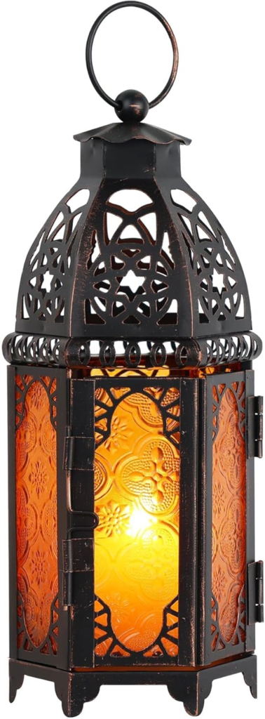
12. Style the Newel Post With a Lantern, a Small Sculpture, or a Single Tall Object
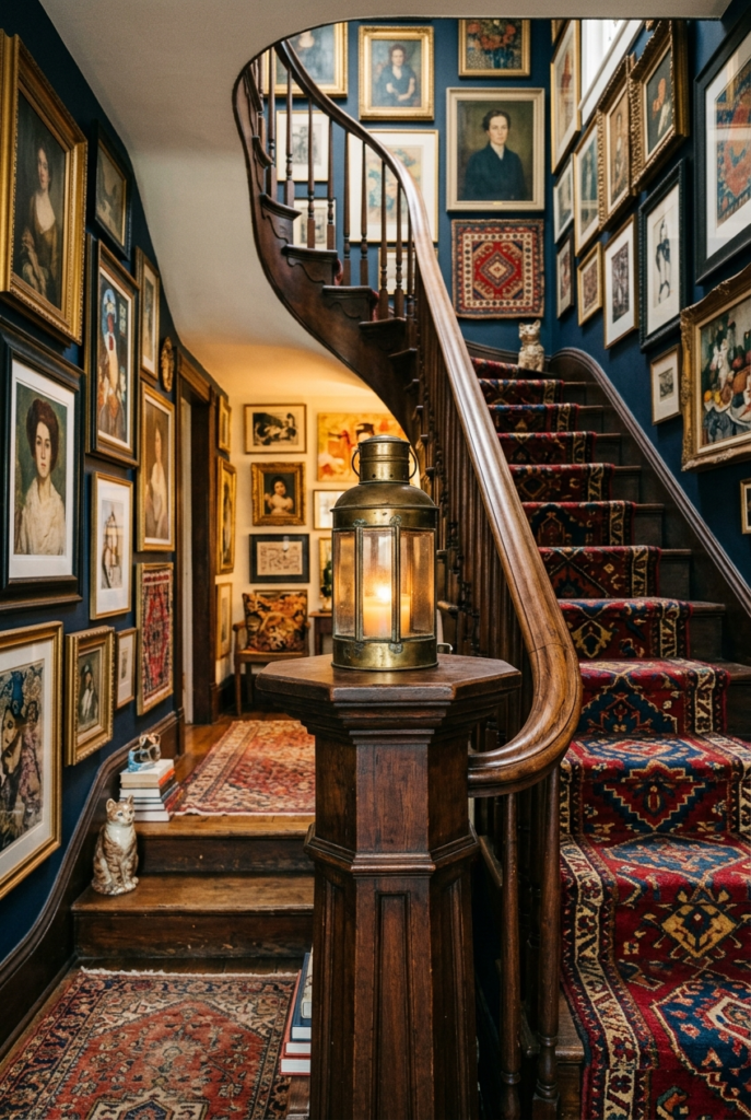
The newel post — the heavy upright at the bottom of the stairs — is a sculpture pedestal most homes ignore. The flat top of the newel post is exactly the right size for a single object placed deliberately. A brass lantern with hurricane glass, a small classical bust, a globe on a brass stand, a stack of three worn-spine books with a candle on top, or a single dried botanical bundle in a small vase — any of these closes the staircase as a designed environment rather than a flight of stairs that happens to have art on the wall. One object only. Crowding the newel post turns it into a cluttered surface; restraint turns it into a final period at the end of a long visual sentence.
Copy this idea:
Where To Start
The wall color and the pendant lamp do the most aesthetic work per dollar. A paint can in burgundy or deep navy at $50 and a Moroccan stained glass pendant at $120–$200 will shift an existing staircase into the maximalist register faster than any other two purchases. If you only have $250 to spend on this project, spend it here.
The gallery wall and the runner are the long-term anchors. Both require commitment — measuring the wall, sourcing the right number of frames, ordering a runner to the correct dimensions — but both deliver the most distinctive visual signature of the maximalist staircase. Save up for the runner; build the gallery wall over months rather than weekends.
Renters can have most of it. Plug-in sconces, plug-in picture lights, peel-and-stick wallpaper, a runner installed without nails, and a gallery wall hung with command strips — none of these damage the rental and most can come down in twenty minutes when the lease ends. The pendant lamp and the paint are the only choices that need a homeowner’s permission.
The Moroccan pendant looks cheaper than it costs. Authentic Moroccan stained glass pendants from importers run $300–$800. Amazon reproductions in the same style run $80–$200 and read identically in photographs and in person, especially in a dim stairwell with the bulb running at 30% on a dimmer. Don’t overpay on this one. [Internal link: 12 Dark and Cozy Reading Nook Ideas]
The single biggest mistake is treating the staircase as decoration. Maximalist staircase decor works because the staircase has been treated as a room — with lighting, seating, a rug, art, plants, and intentional traffic flow. Approach it the same way you’d approach a small living room and the results read correctly. Approach it as “I should hang something on this wall” and the wall ends up looking like an afterthought.